The 6 storey Harper Lane infill form courtesy of Neometro, demonstrates the importance of materiality, quality of construction and focus on tactility and interest at the pedestrian scale. No formulaic podium required in this infill piece, ensuring that all levels with the exception of the recessive 6th, are focused sufficiently on the street edge, and immediate context, creating a notional ‘urban grandstand’ effect.

Image Read More

Leading on from the earlier Neptune Place post, this post seeks to publicise an important medium density experiment in St.Kilda, just a few minutes walk from Acland Street and the Esplanade. As a northerner i from time to time have snubbed my nose at the south, but i’m constantly learning that areas such as St.Kilda, Balaclava and Elwood have been doing density since the 1920s, and have an extensive number of case study worthy projects, from Spanish Mission and Arts and Crafts style apartment complexes with communal courtyards, to infill contemporary townhouses. Whilst this theme will continue to play out in future posts, here i will deal only with the St.Leonards precinct, which contains the main part of a progressive development by Nonda Katsalidis. This project commenced in the 1990s, comprising a series of walkup apartment buildings, individually designed townhouses, and a garden access way to link two disconnected urban blocks.

who says medium density and landscape aren’t compatible?

Image

Read More

Image

A renovated double fronted Victorian presents a meticulously maintained wall of greenery to the street, framing a small outdoor space, and carrying along the street walling.

Image

Image

Pruning vegetation within an inch of its life is not typically appealing to me, as I find it symbolic of a deeper ideological attitude towards the environment and the dominance of man over nature. I cant help but take joy however in this almost Japanese’esque level of meticulous maintenance…which transcends landscape, and presents almost as perfect as a cladding material, complete with uniform thickness and well detailed junctures.

Image

A great little tactile street refuge marks the secondary entry to this dwelling, spilling vegetation around the corner and out onto the street. Sufficiently scaled so as not to feel like ‘entrapment space’ or a space where someone could loiter, this little space is a great contribution to a gritty urban street.

Infill sub-urbanism, 1940s style. Very early modernist dwellings, one of which has been converted into two apartments. Infilling the former georgian and victorian streets of North Hobart, along with a range of far less competent post-war dwellings. This pair are located on Lyndhurst Street, just a 5 minute walk from the main urban village of North Hobart along Elizabeth Street. Super early example of modernism with some remnants of streamline moderne (late art deco) styling. Beautifully maintained white painted brickwork forms are a crisp contrast to the terracotta, reds, greens and browns in the surrounds. Particularly loving the Corbusier style street elevation in the second from the bottom image, and the cantilevered concrete bridge complete with geometric patterned balustrades.

ImageImageImageImageImageImage

Image

who would have thought a roller door in a brick wall could bring such delight. This spring 2011 shot captures a burst of colour in a boston ivy encrusted wall, complete with cutesy street art. Urban happiness where one would not expect it. Any sense of blankness or inactivation is more than compensated by the texture, tactility and the sense of an engaged and productive community.

Making the most of the short distance from work, Urban Planner Ben and I paid a visit to Adelphi, to see how it has aged, almost 20 years since its construction. A lunch time swim proved significantly colder that anticipated, but nonetheless left an impression of how progressive this structure and hotel concept was in the midst of PostCode 3000 and other urban revitalisation schemes in the early 1990s. Whilst the view across the rooftops to the north is compromised somewhat by the 171 Collins development across the road, the roof terrace offers an urban spectacle one couldn’t hope to experience from the ground plane. A sense of playfulness, colour, and a beach like mood are imbued by the turquoise painted pool lining, primary colour (soft deconstructivism) matchstick composition and astro turf (a later addition from what i gather). To experience this space in the course of a typical winter work day is truly mind altering, and i recommend it to anyone within walking distance! Whilst it is in a pretty ordinary state, with an awful amount of rust and in need of a new coat of paint, it is definitely still worth the visit.

NOTE: pool is 20$ entry, without a time limit, and is supposedly 26 degrees in summer, but felt more like 18!

Image

Image

ImageImage

Image

Image

Image

Cyberia showroom, office & apartment, Workroom Architecture, one of my favourite commercial buildings in Melbourne, a heavy assembly of concrete, with the best awning in the city. A concrete awning with cast signage decal permitting growth of lichen and moss. A strategy which has been copied since by Yates and Co in numerous Forrest Hill apartment buildings to the north, including buildings by Plus and Bird De La Couer Architects. The awning cantilevers the floor slab at Level 1, with a low level window showing the continuity of the floor plane out over the sidewalk. The Ando style concrete detailing creates a strong street wall, with a lightweight upper level apartment set back marginally revealing only the lightweight steel framing of a pergola structure.

Image

Image

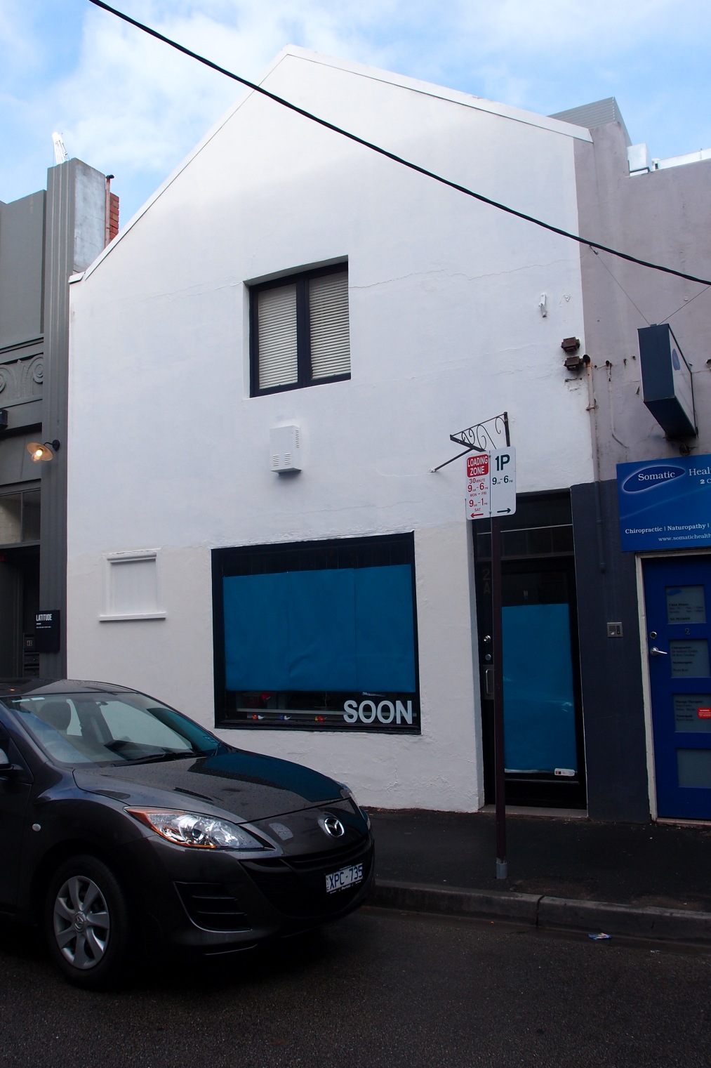
A kind of incidental architecture, a bold composition with an accentuated sense of mass, in singular white rough cement render. the bold geometric punctures with almost zero ornament sits comfortably as a neutral form between an elaborate chicagoesque / art deco neighbour and an ordinary 1980s building.

Image

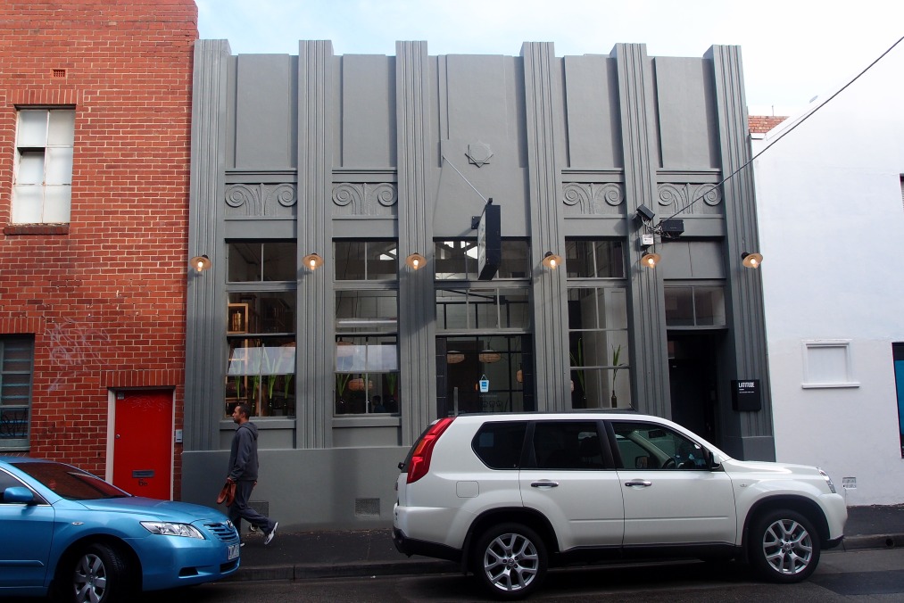
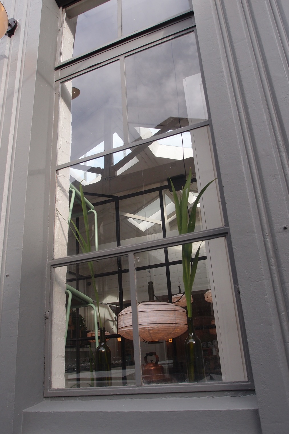
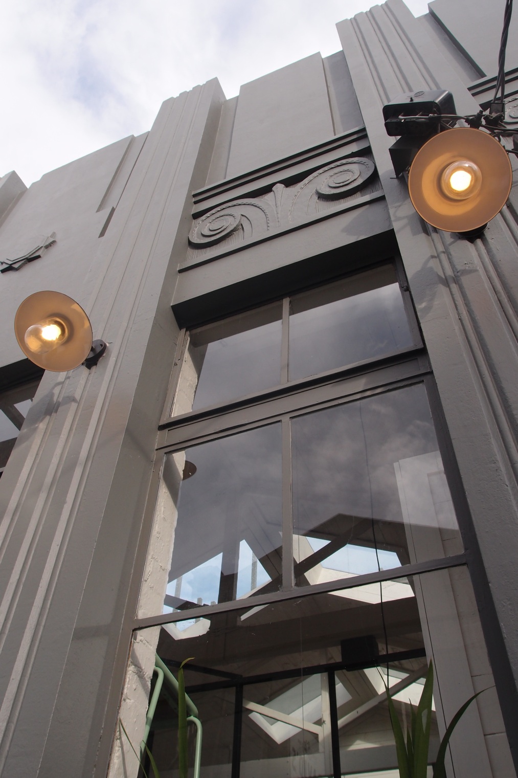
no caption needed…exquisite building, exquisite detail, beautifully preserved and repurposed.

ImageImageImage

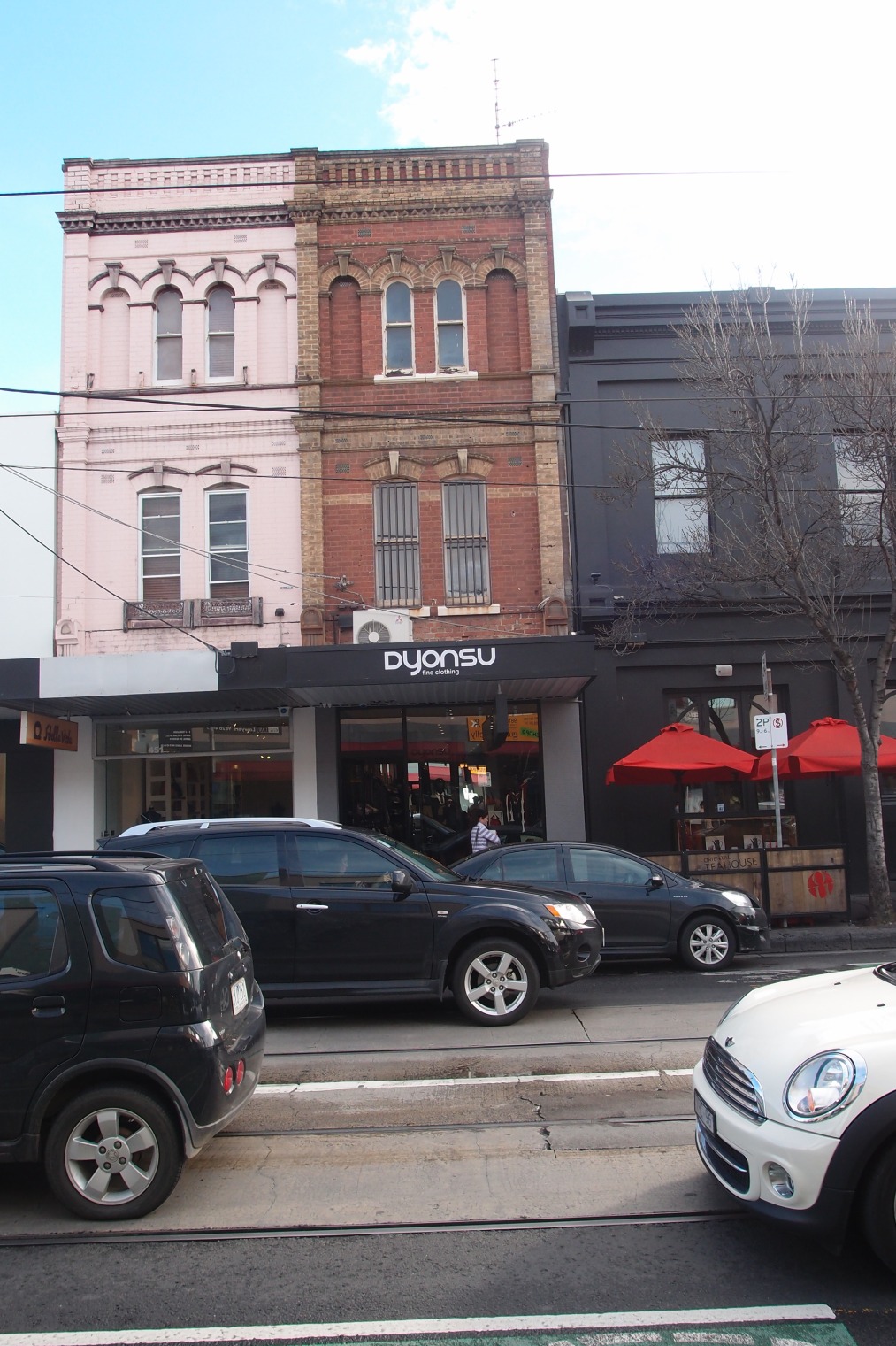
a particularly skinny and interesting late 19th century number, in polychrome brick, employing principles of composition which exaggerate a sense of perspective and height.

Image

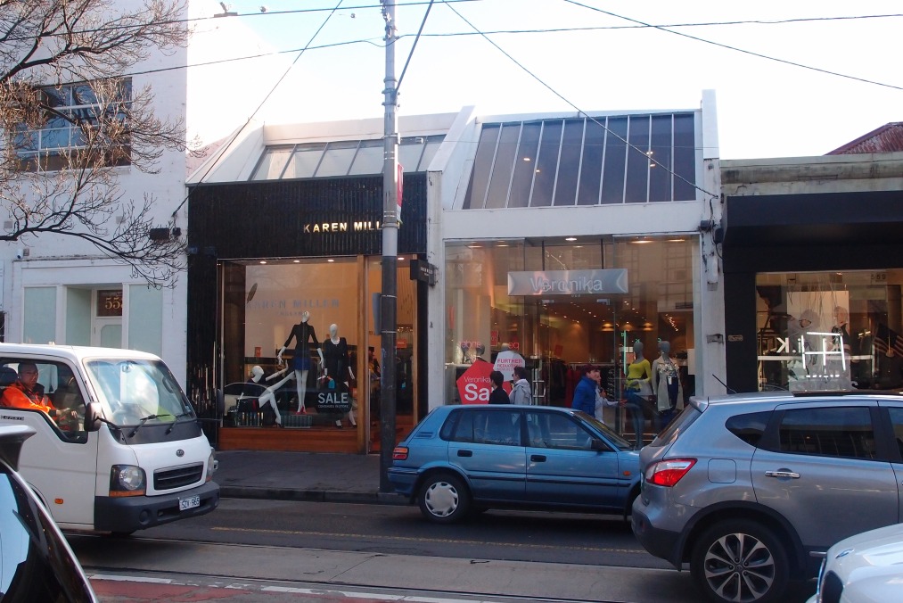
a great pair of 1970s architect designed shops, with requisite chamfered frontage treatment and skylight, and strong projecting party walls.

Image

Image

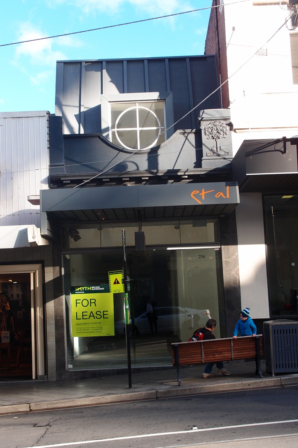
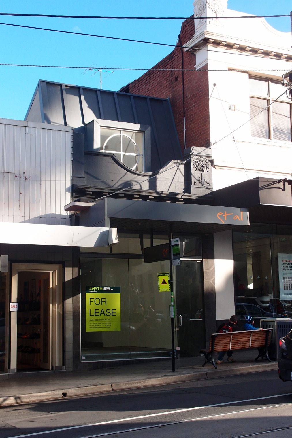
A curious post modern addition to a single storey Edwardian retail form, with tray deck mansard and ‘cross-hair’ type glazing bars to the dorma. Strikes me as a bit of a contemporary commentary on the diabolical fake tudor and renaissance forms dotted further along Toorak Road to the east. Intentionally picturesque, intentionally not derivative through the geometry and materiality.

If anyone knows the architect behind this, please let me know! A bit of a favourite of mine since i first stumbled across it in 2009, this incredible late modernist house has one of the best landscapes in the Studley Park / Kew precinct…great balance between messiness and order. 

ImageImage

Love the way in which the horizontally boarded insitu concrete has aged…moss, lichen etc…creates a cave like quality to the carport. Damn cool Porsche 356 in the carport too.

Image

Another favourite infill dwelling, this time a private job by Ryue Nishizawa of SANAA fame. I have very few criticisms whatsoever of this building, although i would love to meet any building surveyor in Australia who could get approval for glazing adjacent to the side boundaries like that! The thing I love about Nishizawa’s project is the way in which he interrogates the importance of the courtyard and landscape to Japanese living, and seeks to stack it vertically. Perhaps this is something we need to explore more in Australia. Why should we forgo the positive benefits of the ‘suburban backyard’ for a pokey developer apartment balcony. It is perfectly plausible to stack sufficient green space to meet our spiritual need for retreat and repose.

Read More